Samsung Galaxy Z Flip 5
The Samsung Galaxy Z Flip 5 is an attractive phone, offering numerous quality-of-life improvements over its predecessor. The new Flex Window finally elevates the cover screen above just a party trick, the new hinge lets the screen close flat, and numerous other small improvements make this the definitive Z Flip device.
Sadly, the thermal performance and ancient camera hardware hold the unit back, as does the hefty price tag. All foldables are still quite more expensive than their similarly-specced monoblock rivals.
Pros
- Screen finally folds flat
- The new Flex Window is much better than the older cover screen
- The design is true eye-candy
Cons
- Camera still quite mediocre
- Quickly throttles thermally
- Still no dust protection rating
Foldables aren’t exactly known for being the most practical phones. The target audience for these isn’t, and likely never will be the average smartphone user, which is more than happy tapping messages and making phone calls on anything that’s durable and has decent battery life. Durability and battery life, sadly, haven’t been the forte of foldable designs, which often suffer from fragile and unreliable construction due to moving parts, and performance compromises in certain areas due to challenging space constraints presented by the form factor. Finally, they’re quite expensive for the hardware they pack, especially compared to non-folding phones with similar specs.
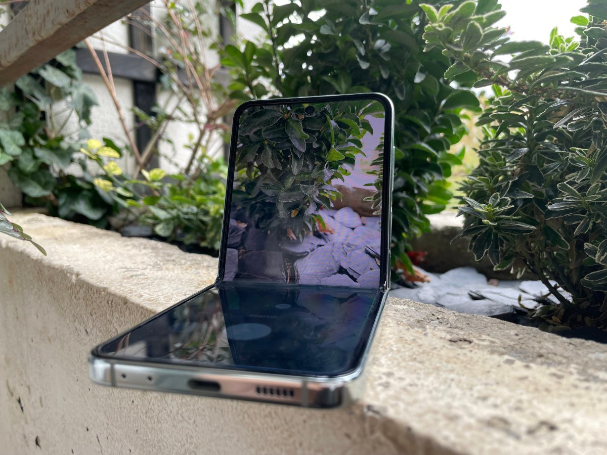
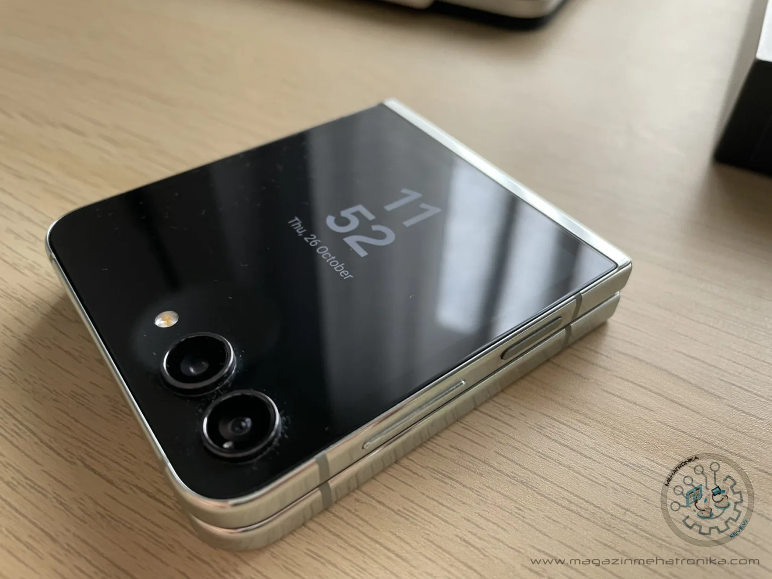
Samsung is trying to tackle some of these concerns with the newest member of the Z Flip lineup: the Z Flip 5. Immediately noticeable is the thinner profile made possible by the new “Flex Hinge”, a clever bit of engineering which allows the phone to close with no gap, finally leaving the “cheese wedge” design days in the past. A tighter-fitting pair of screens leaves less room for pocket lint and other debris to work its way onto the sensitive folding screen, potentially marring it. For a device meant to reside primarily inside a pocket, this is crucial.
Sadly, the impact of this new hinge on the overall thickness of the phone is minimal, and the Galaxy Z Flip 5 is still a chunky little device. When folded, it measures around 15.1 mm, and has a 71.9 x 85.1 mm footprint, making it oddly cute to look at. What’s not cute is the bulk it adds when in a pocket, and especially so a back one, where you’ll absolutely feel it being there. Some phones just disappear when tucked away, but this isn’t one of them. Here’s to hoping Samsung finds a way to make the next series of foldables a couple millimeters thinner.

The new hinge makes us feel more at ease carrying the Galaxy Z Flip 5 around, but we’d still recommend looking after the device.
However, while the new sleek hinge keeps the screens more protected, the IP rating still remains an IPX8 one, claiming no real resistance against dust. With a mechanical hinge (a clear dust ingress point) that’s practically “un-cleanable”, it’s easy to see why abrasive particles present a major durability concern.
The cover screen is gone, replaced by a much bigger (3.4” now, up from 1.9”) and nicer “Flex Window”, which takes up most of the front when folded. The Flex Window retains all of the functionality of the cover screen, but also enables some apps to be completely operated from it, making it much more functional than its predecessor.
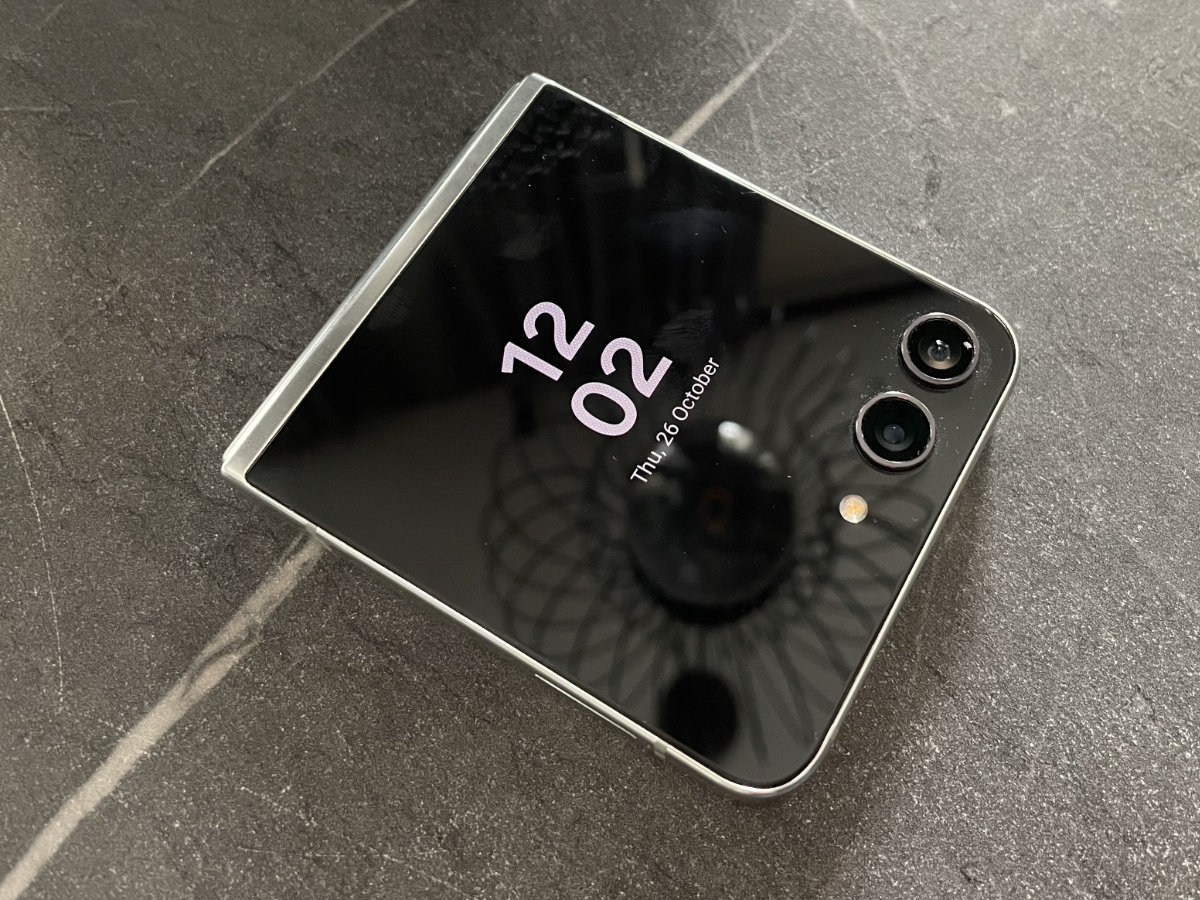
The Flex Window’s UI feels surprisingly like a smartwatch. It’s essentially a carousel of widgets and info panels. There are even some lock screen presets which show data using what’s essentially a set of watch-like complications. Disappointingly, there’s no granular control over these elements, so you’re stuck with what Samsung gives you.
Other lock screen designs offer less data but more customizability, letting the user tweak the screen’s color, layout and even toggle on or off some widgets.

The lock screens on the Flex Window are sadly, well, lock screens, which means they require user authentication to get past. A bit awkwardly, the Galaxy Z Flip 5 hides all of its Flex Window widgets behind this lock, meaning that accessing them is not as seamless of an experience as it should have been. This extra step somewhat defeats the purpose of having a display whose entire purpose is letting the user quickly access essential data without opening the phone. Samsung ought to have included a toggle for the Flex Window lock screen, but it seems that for now, it’s stuck mirroring the main display’s lock screen settings.
The big new thing here is the Flex Window’s ability to run full-blown apps. Well, some full-blown apps, as this is still an experimental feature and Samsung doesn’t want to let you run things which aren’t yet optimized for the odd screen shape. This is all rather impressive and there’s definitely some novelty to it, but we simply don’t get why you’d want to strain your eyes (and hands) using an awkward 3.4” display for browsing the web or scrolling down Instagram feeds when there’s a beautiful full-size panel available to you at a moment’s notice.
And then, there’s the dreaded “open phone to continue” notice which rears its ugly head yet again. On the Z Flip 4’s minuscule cover screen, we can understand not wanting to input any data, but if Samsung expects us to be able to type in a passcode every time we want to access the its widgets (and run full apps!), there’s absolutely no reason why some of Samsung’s own applications require you to open the phone up to finish their setup or customize their behavior. This comes off as a bit lazy. Gah!
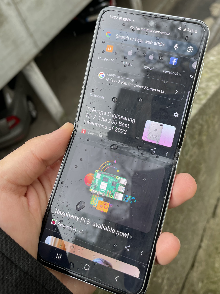
Still, once you get used to the Flex Window’s design quirks (all of which can be patched in a software update, or by using third-party apps like CoverScreen OS), it truly becomes a valuable day-to-day tool, and it becomes clear just how much of an improvement it is over the Z Flip 4’s cover screen. It’s big enough to read out notifications from at a distance, and even run the occasional app.
There is something incredibly charming about the Flex Window implementation which draws you to it, and makes you want to use it. It’s a part of the Z Flip 5’s magic.

The Flex Window does change the design of the phone’s backplates up a bit, essentially removing the top one. This does mean that this time around, there aren’t any dual-color Bespoke edition designs, which were some of the most unique-looking phones around.
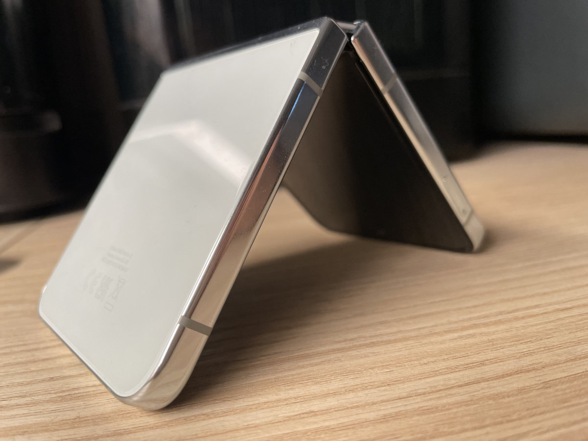
Save for these, the two handsets are virtually identical under visual inspection, with all the design cues staying similar, if not the same. The sides are made from slightly-tinted polished aluminum which looks a lot like stainless steel, and feels quite sturdy. The full-metal frame is only interrupted by plastic antenna bands, which stylishly match the color of the phone’s backplate. In the case of our review unit, which came in the Z Flip 5’s signature new creamy green finish (which Samsung calls “mint”), these were just a tiny bit darker, providing a very sleek contrast against the ever-so-slightly greenish frame. The dark Flex Window almost looked like a chocolate chip, and if we had to describe the phone in one single word, it’d have to be “tasty”.
The Galaxy Z Flip 5 still sports the same 6.7-inch FHD+ (2640 x 1080) 120 Hz “Dynamic AMOLED 2X” panel (marketing speech for an improved HDR10+ certified AMOLED panel), which is now rated at up to 1750 nits peak brightness. This is impressive stuff for a foldable display, and is on-par with other flagship smartphone displays.
This makes the new Z Flip 5 substantially brighter than its predecessor, whose screen was rated at 1200 nits. It wasn’t a dim screen by any means, but we’d be lying if we said that the difference wasn’t quite visible.
The tall 22:9 aspect ratio is certainly still as weird as ever, but it does lend itself well to media consumption or scrolling down mobile-optimized pages. There’s not as much utility to it as to the tablet-sized Galaxy Z Fold series’ displays, but even carrying display as big as the Z Flip’s would be a bit unwieldy for most pockets were the phone not foldable.

The screen looks so good this time around, though. The colors are vibrant and watching HDR content is an absolute treat. The contrast is, as expected from an AMOLED display, brilliant, and the 120 Hz refresh rate makes scrolling oh-so-smooth.
Impressively, the tighter-closing hinge we’ve mentioned doesn’t make the screen crease any more noticeable, which was something we were worried about before getting our hands on a review unit.
The Z Flip 5 comes with 8 GB of RAM, and with 256 GB or 512 GB of storage. That’s enough RAM for any realistic phone use case, and the storage, especially in the higher-spec model, offers more than enough space for all of your photos, videos, music and apps. The entry-level storage model retails for $999, and the higher-end one goes for a bit pricier $1119.
Like all current-gen Samsung flagships, the Galaxy Z Fold 5 utilizes the Snapdragon 8 Gen 2 For Galaxy, which is essentially a slightly overclocked Snapdragon 8 Gen 2 chipset, bringing the Cortex-X3 primary core’s frequency up from 3.2 GHz to 3.36 GHz.

Looking at the SoC design, we see a very interesting trend happening. The octa-core CPU actually features four separate clusters: a single Cortex-X3 primary core running at the aforementioned 3.36 GHz, two Cortex-A715 cores at 2.8 GHz, two Cortex-A710 cores at 2.8 GHz and three Cortex-A510 cores at 2 GHz.
The reason we’ve got both an A710 and A715 cluster is down to 32-bit support. Newest ARM cores, like the A715 and X3 have dropped 32-bit app support, necessitating the inclusion of older core designs in CPUs which need to run legacy software.
The overclock isn’t the only difference between a For Galaxy and “regular” Snapdragon 8 Gen 2 chip, since the customized SoCs contain some Samsung silicon IP, like their custom ISP. In fact, the latter is probably more important of a difference as it seems that Qualcomm has now brought the 3.36 GHz Snapdragon chips to other phones, too.

The CPU of the Galaxy Z Flip 5 scores a very respectable 2017/5102 points in single and multi-core tests in Geekbench 6, respectively. This is as good as it gets in the Android world, and quite a nice step up from the Z Flip 4’s scores, offering double the single-core performance thanks to the new beefy primary core. If your workload requires even more processing oomph though, you’ll have to look over to the Apple side.
The GPU test of the Geekbench 6 suite gives the Snapdragon 8 Gen 2’s Adreno 740 GPU a decent 8454 points on the Vulkan-based test and 9351 points on the OpenCL one. Again, this is a good set of scores, though we were a bit surprised to see the scores going down rapidly after every successive run — first scoring 9351, then 8596, then as low as 6857 points in three consecutive OpenCL-based benchmark cycles.
Uh-oh! It seems that the folding form factor halves the available space for cooling the phone’s powerful SoC, leading to some significant thermal throttling. To ensure this wasn’t just a dud, we used 3DMark’s Wild Life Extreme stress test and discovered that there’s a whole lot more throttling that we would have ever guessed.
Over the 20 consecutive test runs (which take a minute each), the score kept dropping from 3351 during the first run, peaking at around 25 FPS, to 1345 during the worst (18th) run, dropping to a measly 6 FPS, and never reaching more than ~13 FPS.
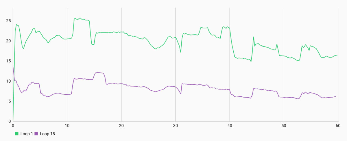
This is quite an issue for gaming, where good handling of sustained graphical loads is key to a good experience. You won’t notice throttling during daily use, like consuming content or replying to a mail — but pick up a heavy game or two (like Genshin Impact or League of Legends: Wild Rift) and you’ll, at best, feel the top half of the phone getting quite warm, and at worst, drop to a less-than-acceptable framerate just a few minutes in.
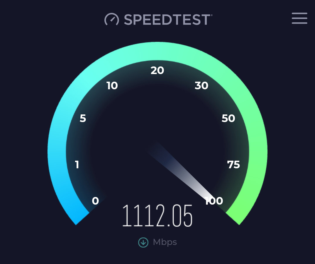
Moving onto another aspect of performance: networking speeds, we’re happy to say that the situation looks way different. The fast Wi-Fi 6E chip enables extremely speedy data transmission, and we were able to hit 1112.05 Mbps in our (unscientific) Ookla Speedtest run.
The same can be said for cellular connectivity. During our tests, we never had the connection drop, even in some areas challenging for other phones. Reportedly, the Galaxy Z Flip 5’s Qualcomm 5G modem can exceed 780 Mbps. These are serious speeds which will future-proof the handset for years to come.
A fast connection is good, but it’s useless if the phone can’t make it through the day on a charge. Luckily, even though it uses the same 3700 mAh battery design of its predecessor, the Samsung Galaxy Z Flip 5 ekes a bit more screen time out of it. We’ve managed to hit around 11.2 hours of browsing time, which is approximately 2 hours more than its predecessor.
This sort of battery performance will definitely get you through the day, even if you throw in some demanding tasks here and there. We’re happy campers, as it seems that the current generation of foldables has finally caught up to its non-foldable competition in this department.
Charging is also pretty good. With 25 W wired and 15 W wireless charging, it doesn’t take too long to top up the Galaxy Z Flip 5. There’s also 4.5 W reverse charging which is useful for small accessories like earbuds.
The sound setup is very much like the one on its predecessor. There’s still no 3.5 mm audio jack. The two speakers sound a little bit tinny, with a very pronounced midrange and a noticeable lack of bass (as expected from a tiny setup like this). With volume set all the way up, there was a lot of clipping and distortion, as is common in smartphones, but at moderate volume, the sound was pretty pleasant to listen to. Decent stereo separation and a relatively wide soundstage with the phone in landscape mode (undoubtedly at least partially due to the width of the phone) makes for a decent content-consumption audio experience.
The microphones are also decent, but suffer a bit in louder environments. Like the speakers, there’s a general focus toward the midrange, making them perfect for voice recordings, which sound full-bodied and clear. A lack of high-end shimmer does affect room acoustics when recorded with the phone, making some spaces sound artificial and muffled compared to real-life.
What’s still a bit underwhelming is the camera system. Samsung essentially reused the Galaxy Z Flip 4’s setup here. It wasn’t a great setup in 2022, and (surprise, surprise!) it’s absolutely not a great setup in 2023. Essentially borrowing the Samsung Galaxy S20’s main 12 MP shooter, the new Flip 5 struggles in low light and handles zoom as well as you’d expect a 12 MP camera to handle it. Samsung claims that some snazzy new AI processing improves image quality, which is true in some cases, with photos coming out less blurry, but also quite the opposite in specific circumstances, with resulting photos just being… weird. Something about the way in which the Galaxy Z Flip 5 processes its images can create very artificial-looking results. More on that in a second.

Samsung tried to get more out of its existing camera hardware by improving upon its image processing algorithms — with mixed results. A thousand-dollar phone really shouldn’t have to rely on tricks to get good photos.
The ultra-wide camera and front selfie cam are also the same 12 MP and 10 MP deal, respectively, but they get a bit more of a lift from the new processing. The ultrawide camera especially deals with noise a lot better. Given how much ultrawides rely on software processing for lens distortion compensation, it’s a lot harder to tell apart artifacts caused by the lens’ unique shape from ones caused by the AI processing missing the mark a little.
When you take a look at the sample shot gallery below, you’ll easily notice the inherent flaws of the camera system. The dynamic range isn’t the best, details easily get lost when zooming in past 2x, and many shots get way too over-sharpened. The main lens does have decently big pixels (due to its 1/1.76” size, which, at the 12MP resolution works out to around 1.12 μm per pixel). This makes the low-light performance impressively decent, with not too much ISO grain.
Now, the default image processing algorithm is absolutely hit-or-miss. Using AI to analyze the scene and fill in blurry areas, the system can sometimes absolutely turn a shot around. However, we’ve also seen moments where it completely mangled photos, introducing uncanny artifacts and, honestly, making the whole shot look AI-generated.
Since the algorithm takes a few seconds, we were able to take screenshots of our images before the AI got to them, so here’s a few examples.


This wasn’t too bad, as the image processing algorithm accurately followed shapes, introducing only minor artefacts. It didn’t get rid of all the blurriness but it also hasn’t mangled the image too bad.


Nope. This one isn’t good at all. At a glance, it might seem like an improvement, but look at the massacred brick wall and artefacts introduced to text and graffiti, as well as the worn-out concrete fencing. The brown iron fence on the right even shows some perspective warping. What on earth is going on here? This feels like a generative AI’s fever dream, and not a phone shot.


This is better, and actually shows the image processing working okay-ish (though, an actual good example would be the flower macro shot in the full-size image gallery below). There’s still a lot of obvious processing artefacting going on, but it’s not uncanny. In all honesty, it might be due to the organic shape of the subject which simply hides these better than the clear-cut edges of the previous image.
While it’s impressive that we’re now using AI to improve photos, it’s clearly not up to the task yet. A similar algorithm should exist in the S23 Ultra, but maybe its better camera hardware leaves less room for the AI to be “creative” and produce results like the ones we’ve just seen. With the 12 MP shooter we’ve got here, at times the AI royally messes up and creates something of an unsalvageable eldritch concoction. Naturally, this can be disabled by using the “pro mode”, which lets you have manual control over all camera settings — but at that point, the outdated camera hardware becomes even more painfully obvious.
Now, let’s take a look at some shots which aren’t all that bad. From decent landscape and ultra wide photos to an actually impressive flower macro shot, here’s the best we were able to achieve with the camera in various environments.
Like its predecessor, the Galaxy Z Flip 5 is a mean selfie machine due to its unique Flex Window, which lets you use its main 12 MP shooter to take selfies. The larger cover screen here helps quite a bit with framing your shot, but, due to reused hardware, that’s as much of an improvement as you’ll realistically get.
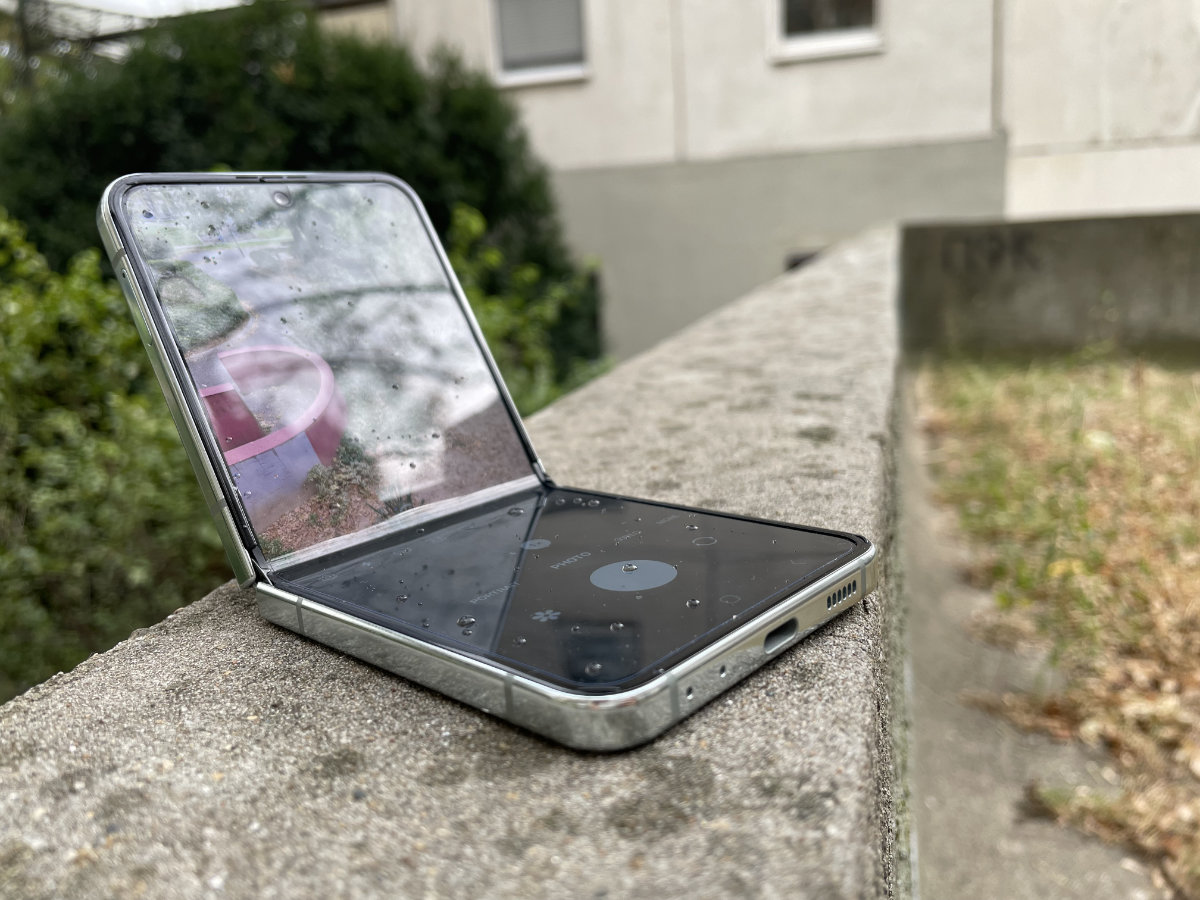
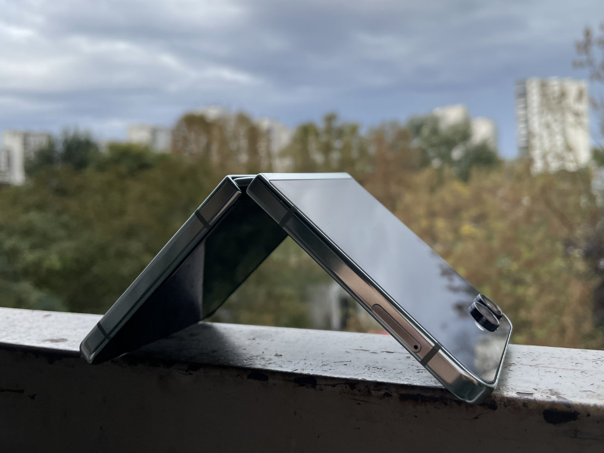
Also, like every Galaxy Z Flip before it, the phone can act as its own “tripod”, which does enable some interesting shot angles. Also, the ability to angle and position the top half of the screen in a laptop-esque manner allows for great flexibility when taking hands-free video calls or simply consuming content with the phone sitting on a desk.
And Samsung really wants you to use the new Z Flip 5 in this way, as they’ve pushed out a slew of refinements to flex mode, a clever bit of software design which turns the bottom half of your screen into a trackpad surface, control keypad or secondary window depending on the app. Not all apps support this, but it was a joy finding out which ones do. The whole UI shifts around magically the second the screen gets folded, and when it comes to some apps, this quasi-dual-screen layout works much better than the stock one.
Even though we love stock Android, OneUI offers many neat tricks and useful features, especially for foldables.
Is flex mode worth getting a foldable phone for? Not really — at least not on the Galaxy Z Flip, where the screen size limits the mode’s utility. Is it a cool and novel way to interact with your favorite apps (and it feels just right for some)? Yes, but you’ll get by just fine without it.
So, who’s this new member of the Z Flip family for?
As always, foldables are for phone aficionados, and still aren’t going to be the phone of choice for most. Much harder to maintain and, let’s face it, more experimental in nature than their traditional counterparts, these devices attract those who find joy in owning a well-crafted, unique and powerful handset.
While Samsung has been busy at work improving the main shtick of the Flip series, the front screen, they’ve slacked off a little in the camera department (well, majorly slacked off might be closer to the truth) and thermal management. Even though the Galaxy Z Flip 5 has the Android chipset of 2023, the Snapdragon 8 Gen 2, the thermal throttling makes the new Flip score worse than other phones with the same chip (e.g. the S23 Ultra) in many tests, and especially so in graphics-intensive ones.

Ultimately, some of our criticism applies to the foldable form factor as a whole, and not just the Z Flip 5 specifically. Durability concerns, questions about general practicality, and high price are common pain points for most folding handsets.
But credit where credit is due, Samsung’s latest entry in the Galaxy Z Flip series is the best one yet. Good battery life, a lovely screen and some real quality-of-life improvements make this the easiest foldable for us to recommend. And, if you’re willing to overlook its flaws and are brave enough to take the (at least) $1000 plunge, the Galaxy Z Flip 5 might currently be the best phone to accompany you on your journey.


